The internet keeps changing, and the websites people expect to use change with it. New tools and design approaches can make sites faster, easier to navigate, and more engaging—especially for businesses whose work depends on strong visuals. Keeping up with Web Development Trends does not mean rebuilding a site every year. It means understanding which changes solve real problems for visitors and choosing the ones that fit your goals.
Here are 10 developments worth watching, along with practical ways to think about them when planning or improving a website. For photography portfolios, the challenge is to showcase images beautifully without sacrificing speed, accessibility, or a comfortable browsing experience.
Smarter, more flexible foundations
AI-assisted development
AI tools can help developers draft code, explore layout ideas, and handle repetitive tasks. They are most useful as assistants, not substitutes for review. Generated code and content still need human checks for accuracy, security, accessibility, and fit with the brand.
Responsive and adaptive layouts
Visitors use screens of many sizes, so layouts need to work beyond a desktop monitor. Responsive design adjusts elements to the available space; adaptive approaches can tailor experiences to different contexts. For image-led sites, test how galleries, menus, and captions behave on small screens—not just whether the page shrinks.
Better experiences for every visitor
Performance-focused experiences
A visually rich website can feel frustrating if its pages take too long to appear. Developers increasingly treat performance as part of design, using appropriately sized images, efficient code, and careful loading strategies. A portfolio can preserve visual impact while avoiding unnecessarily heavy files.
Accessibility as a design priority
Accessible websites consider visitors who navigate with keyboards, screen readers, or other assistive tools. Clear headings, readable contrast, descriptive image alternatives, and controls that are easy to use all help make a site more welcoming. Accessibility works best when it is considered from the start rather than added as a final patch.
Progressive web app features
Progressive web app techniques can make some browser-based experiences feel more like apps, with options such as installable access or selected offline functions. Not every business site needs these features. They make sense when they support a clear visitor need, such as reliably accessing key information while connectivity is limited.
More adaptable content and interaction
Flexible content systems
Modern content management can separate the way information is stored from the way it appears on a page. This gives teams more flexibility to reuse content across formats, though a more complex setup is not automatically better. The right system should make routine updates manageable and keep the site structure understandable.
Motion and micro-interactions
Small animations can show that a button has been selected, guide attention, or make a transition feel more natural. Used with restraint, motion adds clarity and polish. Too much movement can distract from the content or make browsing uncomfortable, so provide a calm experience and respect reduced-motion preferences.
Trust built into the experience
Privacy-conscious design
People are increasingly attentive to how websites collect and use their information. A practical response is to collect only what is needed, explain choices in plain language, and avoid adding tracking or forms without a clear purpose. Privacy should influence decisions about tools and features, not just the wording of a notice.
Stronger security practices
Security is an ongoing part of website maintenance. Using reputable tools, updating software, limiting access to what each person needs, and protecting account credentials are sensible foundations. Site owners should also know who manages updates and backups so that security does not get overlooked after launch.
Visual storytelling with purpose
Immersive visual storytelling
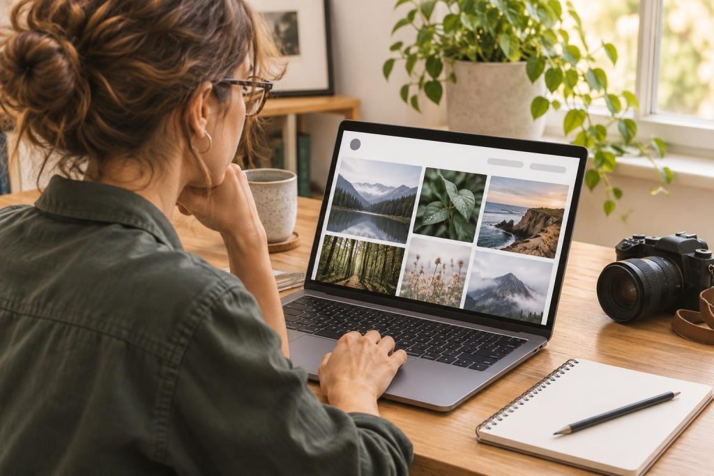
Websites continue to explore richer ways to present images, video, and interactive elements. For a photography portfolio, that might mean a thoughtfully sequenced gallery or a focused full-screen image view. The goal is not to add effects for their own sake, but to help visitors understand the work and find relevant details without losing their way.
These trends can overlap: a beautiful gallery also needs responsive layouts, fast-loading images, accessible controls, and careful privacy choices. Before adopting a new feature, define the visitor problem it should solve, then test it on real devices and with realistic content.
Conclusion
The most useful Web Development Trends are not simply the newest ones. They are the changes that help people access information, enjoy a smoother experience, and feel confident using a site. Start with your audience and your website’s purpose, then prioritize improvements such as speed, accessibility, responsive layouts, and clear visual storytelling. A considered approach keeps a website relevant without adding complexity it does not need.
Planning a website or refreshing a visual portfolio? Explore the photography work and consider how thoughtful images can help tell your story online.